Tuesday, 25 October 2011
Sunday, 2 May 2010
Bibliography
Culhane, S., 1988. Animation From Script to Screen. New York: St. Martin’s Press.
Hart, J.. 1999. The art of the storyboard : storyboarding for film, TV and animation. Oxford: Focal Press.
Laughey, D., 2007. Key Themes in Media Theory. Maidenhead: Open University Press.
Meyer, S., 1983. A treasury of the Great Children’s Book Illustrators. New York: Harry N. Abrams, Inc.
Meyer, T., and Meyer, C., 2009. After Effects Apprentice Real-World Skills for the Aspiring Motion Graphics Artist. 2nd ed. Burlington: Focal Press.
Pearce, F., and Wootton, D., 2003. The Illustrators The British Art of Illustration 1786-2003. London: Chris Beetles Ltd.
Pilling, J., ed., 1997. A Reader in Animation Studies. Sydney: John Libbey & Company Pty Ltd.
Pilling, J., 2001. Animation 2D and Beyond. Grans-Pres-Celigny: Rotovision.
Rackham, A., 1979. Rackham’s Color Illustrations for Wagner’s “Ring” with an introduction and captions by James Spero. New York: Dover Publications Inc.
Roberts, S., 2007. Character Animation: 2D Skills for Better 3D. 2nd ed. Oxford: Elsevier Ltd.
Scott, J., 2002. How to Write for Animation. Woodstock: The Overlook Press.
Stafford, R., 2007. Understanding Audiences and the Film Industry. London: British Film Institute.
Warner, M., 1994. From the Beast to the Blonde Fairytales and their Tellers. London: Chetto and Windus Limited.
Webster, C., 2005. Animation: The Mechanics of Motion. Oxford: Elsevier Ltd.
Wells P., 1998. Understanding Animation. Abingdon: Routledge.
Whitaker, H., and Halas, J., 1981. Timing for Animation. Oxford: Elsevier Ltd.
Wright, J., 2005. Animation Writing and Development From Script Development to Pitch. Burlington: Focal Press.
Webography
Filmography
The Adventures of Prince Achmed, 1926. Directed by Lotte Reiniger. Germany.
Hansel and Gretel, 1955. Directed by Lotte Reiniger. Germany.
Jack and the Beanstalk, 1955. Directed by Lotte Reiniger. Germany.
Princes et Princesses, 2000. Directed by Michel Ocelot. France.
Sleepy Hollow, 1999. Directed by Tim Burton. USA: Paramount Pictures.
The Secret of NIMH, 1982. Directed by Don Bluth. USA: MGM.
Romeo + Juliet, 1996. Directed by Baz Luhrman. USA: Twentieth Century Fox Film Corporation.
Sleeping Beauty, 1959. Directed by Clyde Geronimi. USA: Walt Disney Productions.
Friday, 30 April 2010
http://www.youtube.com/watch?v=rBe4IUQePbg
this is my final film. i will be handing this in!!!
the last alterations were:
this is my final film. i will be handing this in!!!
the last alterations were:
- title - which i changed from the original text because a classmate said the font was quite hard to read, so i have compremised, it is still fairly fancy and gothic/fairytale but now it is a clearer font to read.
- i added in credits - me, obviously coz i made the film, then dan Tyler for the music, and i thanked nick phillips as he was my tutor for the most part whilst making my film. the end shows the solent uni's logo as i have been here three years and this is where i made the film and where (fingers crossed) i will get my degree. so if i hadnt come to solent this film wouldnt be.
- the flame in the chapel i animated in flash and then blurred it in afx
- the glinting effect on the pendant as it spins round that i did in afx by masking a white solid and feathering it, then animating it using the opacity tool
- i added in some moving branches to the scene where mother and daughter are walking up to the chapel as there is a strong wind blowing and so it adds to the apprehensive atmosphere and makes it a bit spooky, (i love the sound the loon makes also). the branches also lead the eye to the chapel a bit more too which is good coz it is in the distance and may have been overlooked by some viewers.
- after struggling many times to get the movement and the aesthetic of the slope right, it still wasn't working. so as suggested by a tutor i changed it to them falling through foliage. which looks much better and is more in keeping with the rest of the backgrounds, and still hopefully looks a bit disorientating so the audience are like "uh-oh" coz i added in blurs effects on the backgrounds and the camera pans to follow their decent. and as i have changed this background it ment i then had to change the other backgrounds where we see the slope by adding in foliage.
- the final change was to simply flip over a scene so the attention was more on the bottom right hand corner as previous scenes were focused there
- other changes i had to do was to correct the opacity of the some of the characters in many of the scenes because my Flash had a glitch and kept turning the opacity down to 96%, and i didnt realise until i rendered out because you could see the background through the characters and so i had to go back and recolour them at 100% and rerender. also other things like single frames being zoomed out instead of in and her missing half a head in one or him half a body and her disappearing before the end of the scene or the light going out a frame too early, etc. etc. so rerendering whole scenes to correct little errors. hopefully i have managed to spot them all now! and my film should be a-ok :)
Tuesday, 27 April 2010
http://www.youtube.com/watch?v=GaJheAAJiZg
animatic with new music on. just adding a few bits of afx but i dont want to add too much movement in the background coz it will detract attention away from the characters. so i think im pretty much finished :)
Friday, 23 April 2010
here is my 'tweened film so now all i need to do is afx like a flame and pendant sparkle in the chapel and if i have time leaves blowing in the wind and dust when they fall. not sure whether i need anymore sound effects perhaps one or two but i dont wanna overdo it and ruin the atmosphere. music is next though.
http://www.youtube.com/user/VioletFX#p/a/u/0/0NmJkRFe_uk
I have tried to keep the animation within the style of Lotte Reiniger and her shadow puppet animation by animating each body part of the characters separately so to give the effect of the pinned joints in the cut out characters of shadow puppets and how that makes them move. i also have tried to make the walk cycles for the mother and daughter slightly disjointed too so as to keep them looking like bugs and that they have 4 legs under their cloaks, it is kind of like in Men in Black when the big cockroach alien has to fit inside a human skin.
Saturday, 3 April 2010
here is yet another animatic, these are the last changes i will make because now i reallly am behind and really do need to get on with my inbetweens which i now only have 2 weeks to do them in :(
http://www.youtube.com/watch?v=oHdkJgmGmaE
the changes i made were to get rid of the montage scenes of a day of love for the daughter and male and replace them with less static imagery and have just one activity which is him ctaching a butterfly with heart shaped wings ripping off a heart shaped wing and giving it to her to eat, she eats and then he throws the rest of the butterfly up in the air and leaps on her in a romantic jestful way, i have created a dissolve using hearts falling down over the scene to lead on to the next scene where he goes in to kiss again and then they hump.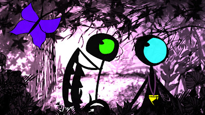
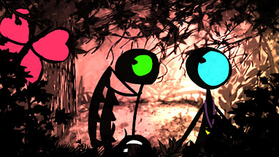
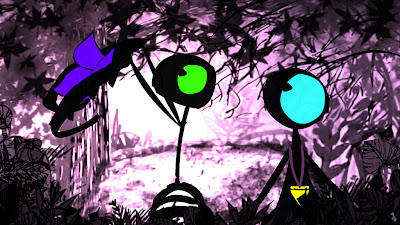
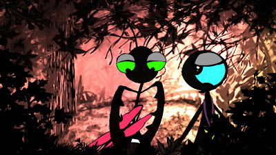
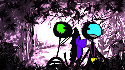
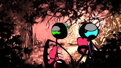
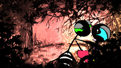
 also i have changed the slopes to soften them up so they are not such an eye sore and dont detract attention away from the characters. but i am still not happy with them. i think they are now too untextured and i liked the lens flare i had on before. so i may alter again if i have time.
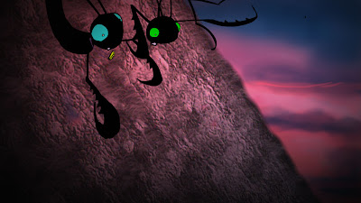
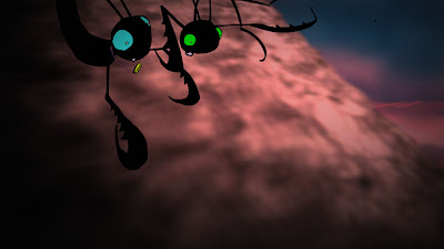
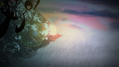
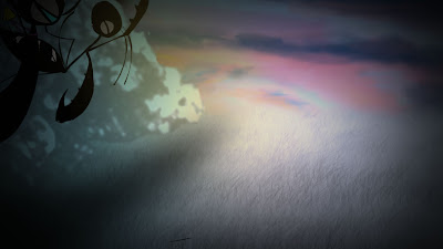 i also made hands come apart and touch before their first kiss but i think i preferred the fact they were always holding hands and they they suddenly notice so i dont know what to do about that.


 also i have changed the slopes to soften them up so they are not such an eye sore and dont detract attention away from the characters. but i am still not happy with them. i think they are now too untextured and i liked the lens flare i had on before. so i may alter again if i have time.


 i also made hands come apart and touch before their first kiss but i think i preferred the fact they were always holding hands and they they suddenly notice so i dont know what to do about that.
Sunday, 28 March 2010
research for romance in animation:
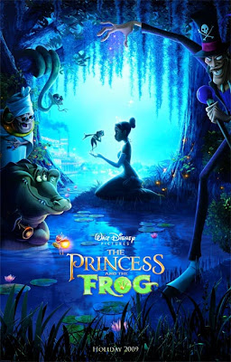


this is nicely silhouetted and would work wonderfully for a romantic scene in my film. i would like to have the daughter and male looking into each other eyes, with soft lighting and soft sweeping branches and flowers surrounding them like this princess and frog poster.
this one is good for the whole candle light, big eyes, loving gaze type imagery. i cant use actual candles but i can try and make the lighting soft and glowy.
this one is good coz it is showing her looking lovingly at him even when he is not looking at her. lingering gazes = love
i was always gonna have the antennae make a heart shape when they kiss but i might make it more obvious now.
loving gaze again, and the closeness of their faces and half closed eyes, and also a rose is a good symbol of love. the apple looks heart shaped so i could incorporate something like that in my film, perhaps make the butterfly red and each wing could be heart shaped so the male could rip of a wing and give it to daughter. also food and feeding one another is supposed to be sensual so it all adds to the audience getting that they are in lurve.
http://www.youtube.com/watch?v=-kytjRM1A6I
here is my animatic before 'tweens. a couple of changes like the montage bit having actual animation in it now to make the film flow better as the shots look TOO static. i will also make it even more romantic and have heart shaped leaves and a rose.
the slope background need to be altered coz they are too textured and in your face so i will soften them and try make them look more similar to each other too. also the hand holding part i will show the hands come together for more of a audience "aawww" reaction.
then i will inbetween it. then add title and credits, then add in any afx effects, then some shadows if i have time. a few more sound effects and the music should be done by end of easter too.
Friday, 12 March 2010
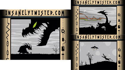
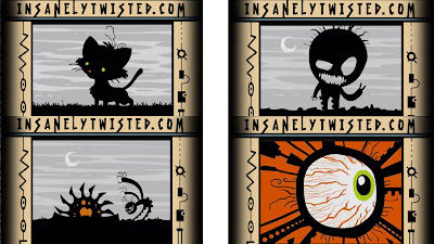 I have just found my new favourite cartoon!! it is Michel Gagné's Insanely Twisted Shadow Puppets. It is shorts done in flash and in black and white silhouette with a touch of colour. the crispness that flash gives makes the characters stark contrast really dramatic. It is an awesome look and really shows off not only flash but the use of silhouette style, it emphasises the insanity of the "Insanely Twisted Shadow Puppets" and i also think that the teeth on some of the monsters are similar to my praying mantis' and their claws ;)
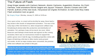 http://www.awn.com/articles/technology/future-flash#
interesting article saying about how flash is better and how it is the way forward for animation. so I am very glad I have chosen to animate in flash, although this film will be the first time I have ever used flash I hope that I can utilise the software in order to achieve the style I want and make an overall pleasing film.
http://www.dailymotion.com/video/x4wc6s_the-art-of-lotte-reiniger-19531971_shortfilms

an interesting documentary about lotte reiniger. her work is a cross between stop-motion and 2d. it looks like it is very fiddly and painstaking, and the thing with moving the whole set because the camera is fixed!! i am so glad i am doing a modern version of silhouette animation!
http://www.youtube.com/watch?v=fcT5NErHlSQ
this is my march animatic, i think i should have more animated by now, it is taking much longer than anticipated. but where i have already coloured i think i can catch up ok. I have made some more minor adjustments to some scenes but overall the timing and action will remain the same. this week i plan to improve the animation by way of increasing the emotion (acting and facial expression) along with making these emotional beats in the story last longer so the audience has time to take in what is going on and empathise with the daughter plus a few tweaks on walk cycles, and more exaggeration on some movements and then i will be all set to inbetween. i have also added in some more sound effects and only need a couple more.
Tuesday, 16 February 2010
http://www.youtube.com/watch?v=8fsYniwUNck
latest animatic. ive tried to make the end more dramatic and cut out unneccessary bits in the beginning but i think some scenes just need to be longer. I am behind my original schedule but feel i can catch up, or i will have less time on neatening and afxing.
Saturday, 30 January 2010
http://www.youtube.com/watch?v=_aY7FXpoJCE
this is the end of sleeping beauty as i think the way it has been staged inducing fear and the dragon esp with it's snapping jaws, therefore i will be thinking about this when i come to do my scene where the mother is coming doen the hill to get her daughter's lover.
schedule at the mo is:
sort out changes by 5th feb.
music on 6th and 7th feb.
finish keys by 18th feb.
finish breakdowns by 10th march.
finish inbetweens by 7th april.
neaten by 14th april (as i am colouring as i go).
blog printed and sound effects and music sorted by 19th april.
shadows and lighting and camera and blur effects and flame effects done by 30th april.
title and credits done by 5th may.
hand in 6th may.
after talking with various people and reviewing my animatic i have decided to make changes to make film flow better, read better and look better, here goes:
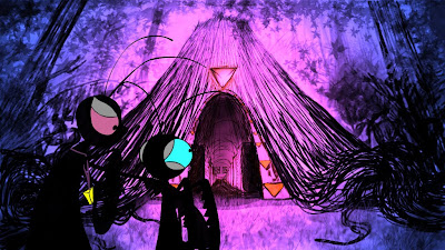
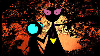
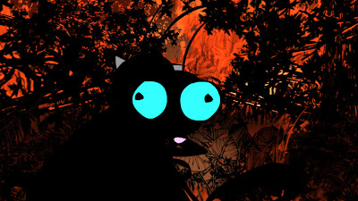
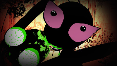

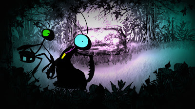
- longer time and a closeup of mother seeing daughter watching as she munches on the stepdad's head. she should then drop head instead of put down (both for timing issues and it is more like she cares about daughter and not head). Then the hug after this should last longer so audience see she is reassuring daughter and not going to attack her after all, it is important to make enough time for shots so the audience register what is going on. after hug they walk towards camera, dip to black, then arrive at long shot of chapel so it is smoother running and also saves a couple of seconds that i needed to make other scenes longer. like perhaps i will make the scene of the closeup outside the chapel a bit longer so the audience can see properly what it is.


- when they are in the chapel although i have changed this scene greatly and lengthened it i still think there could be a tiny bit extra time for mother to get pendant off alter as it still looks like we dont know where this pendant has appeared from.


- when daughter bumps into male she should look at pendant and back at where she has come from and then panic and grab male and run. make the running more manic by cutting to closeups of faces. then instead of them tiring they should just burst through onto the scene with the rock on which they sit panting heavily.
- when they kiss daughter should look at pendant while still kissing and the male doesnt notice. this is because the male remains oblivious to her tradition and his potential fate.

- the moving backgrounds need to be sorted.

- the forefront background foliage should be darker. the slope is to be made more textured and hard edges should be softened.


- her tears are in wrong place and when she is crying this scene should be more over the top and she should be more upset and maybe caress severed head.

- the scene where the mother is coming down the hill should be more scary so i will do cuts to closeups of mother's face and daughter reaction and mother's chomping jaws. perhaps the arms should claw at ground too.


- the end scene needs to be bleaker and washed out colours, and colours throughout film are too many and in some places too strong. save strong colours for important strong emotions.
- when daughter throws down pendant she should be more upset and dramatic so i will have her tugging at the pendant trying to get it off and when mother tries to stop her the daughter bats away her arm. the daughter manages to rip her pendant off and throws it at mother.

- when daughter walks away we should see the reaction of the mother more and the mother should be upset and remorsful and drop to her knees or something.

- the final shot of the daughter with her baby should be a different background maybe. maybe the one of the rock because it is where her and the male had their first kiss.

Subscribe to:
Comments (Atom)


